This is a review of an unregistered user initiating and reviewing search results through Hipcamp’s mobile website. Hipcamp does not have a mobile app; mobile users will be directed to Hipcamp’s mobile website experience. This review was conducted on April 19-23, 2018 on an iPhone 6.
High Level Findings
Overall, the user flow from initiate to view search results takes three to four screens, depending on the filter or list view selection. The designs and icons are visually appealing.
There were a few inconsistencies when comparing the mobile to the desktop experience. Several functional and navigational features did not translate when the site was accessed via mobile app. It does seem that Hipcamp is actively updating the site, as the site was updated twice during the window of the review. The ability to push frequent updates without having to release a new app is a benefit of having a mobile site.
The recommendation would be to focus on providing an optimized mobile experience.
Campsite Search
The good:
Hipcamp allows new users to search for sites without having to join/login. The mobile site prompts the user to join/sign into Hipcamp, but the user can dismiss the screen and proceed directly to search.
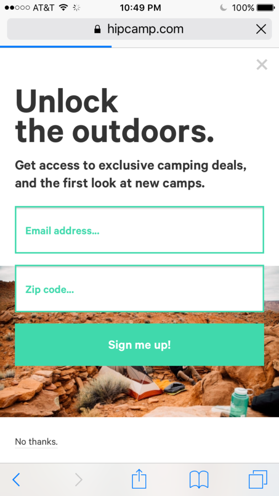
The “Find camping near…” and “Discover camps near me” calls to action copy are conversational, and engaging. The “Discover” call to action allows the user to immediately explore listings without requiring any user input.

When the user types in search criteria, Hipcamp provides helpful suggestions. If the location search criteria is not filled in, the website defaults to the user’s current location.
Suggestions:
- Create rules for Current Check In/Check Out dates that will ensure users select valid booking dates (this issue was noted at the time of original investigation on April 19. However, proposals 1-4 were fixed by April 22 as seen below).
 Proposal:
- Restrict users from selecting dates in the past
- Restrict users from selecting dates more than a year in advance
- Require that the Check Out date be after the Check In date
- Provide calendar view for easy date reference
- While selecting check out date, indicate the selected check in date on the calendar
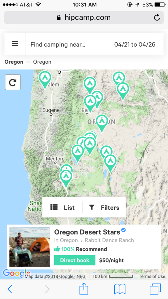
Search Results – Map View
The good:
The user can navigate to different parts of the map and refresh the search results for campsites in this area by tapping on the refresh button. The region name on the top left is updated to reflect the new search area.
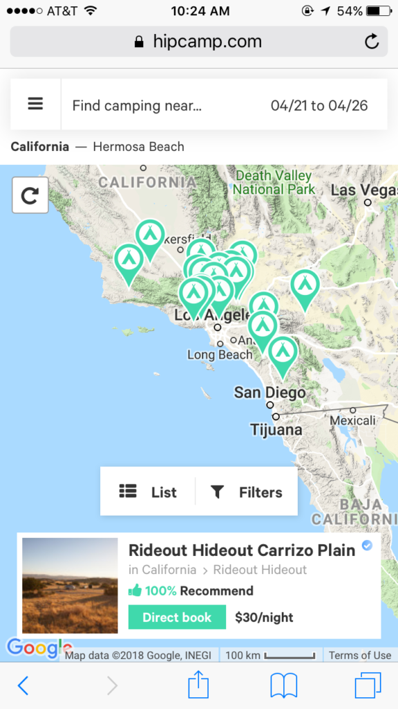
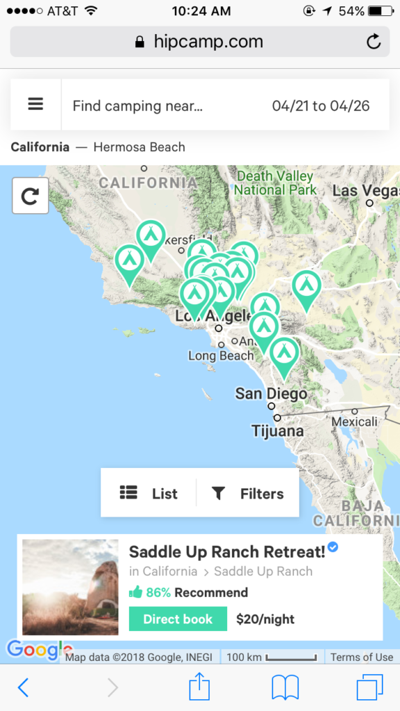
When the user taps on the campsite listing highlight card, the detailed listing is opened in a new window. This allows the user to open several listings at once, while not having to rerun the original search.
Suggestions:
- The user taps on different pins on the map, and the corresponding campsite details card appears on the bottom of the screen. It is unclear where on the map/which pin represents the listing on the campsite details card. Changing the color of the pin for the selected campsite would help indicate the campsite on the map.
- The List and Filters icons take up significant amount of space. This would be a major issue for small screen size phones. These could be placed to the right of the location information to save screen space.

Filter Results
The Good:
There are 40+ attributes that a user can use to filter search results. The amenities have appealing icons that make the selections more interesting.

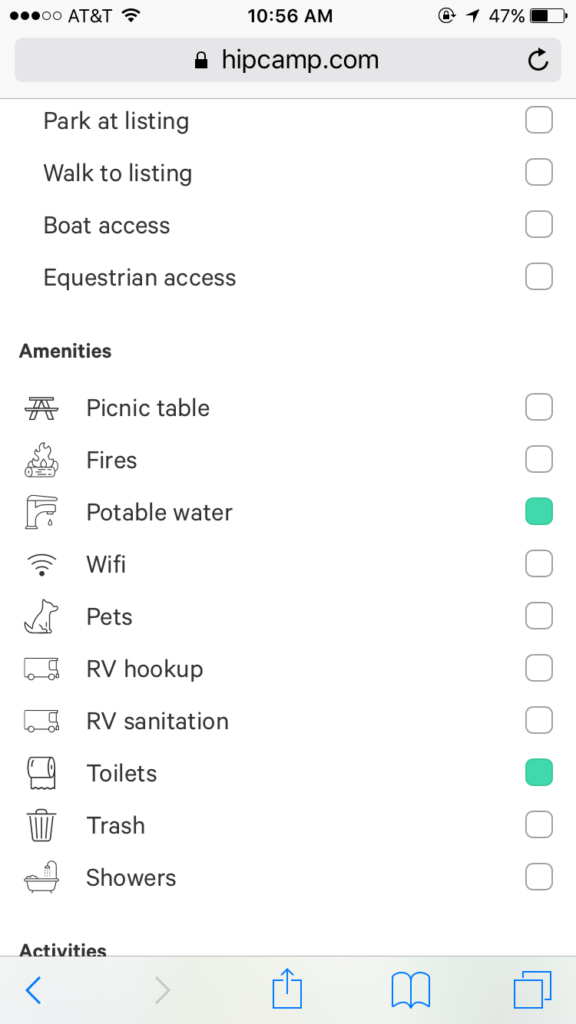
Suggestions:
- The “Done” button should persist at the top of the screen while the user scrolls down to view all filter options. This will allow the user to tap “Done” once filters are selected without having to scroll back up to the top of the screen.
- Allow the user to select and unselect all attributes within a category (e.g. only the glamping subsection has select/unselect all). This helps the user easily navigate through the 40+ attributes.
- Include a clear all filter selections button.
Search Results – List View
The list view provides a summary of the search parameters as well as an inviting description to interest the user.
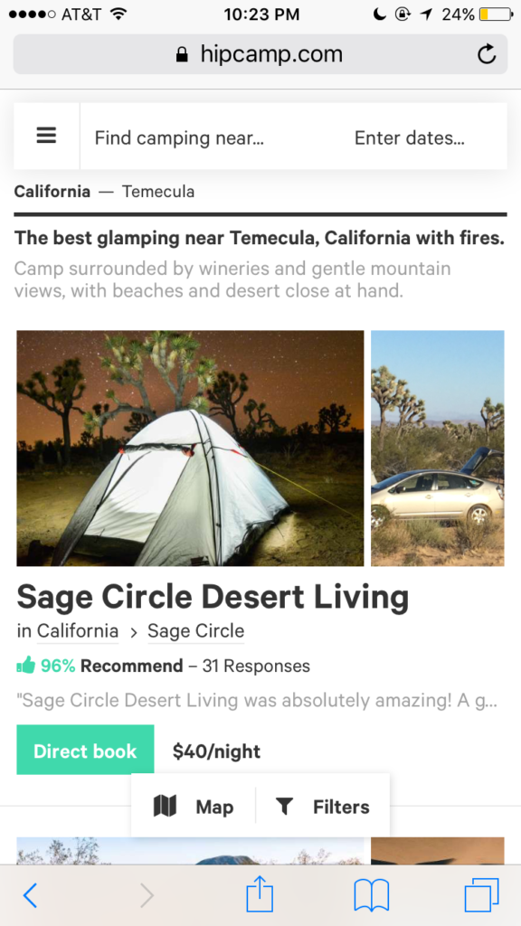
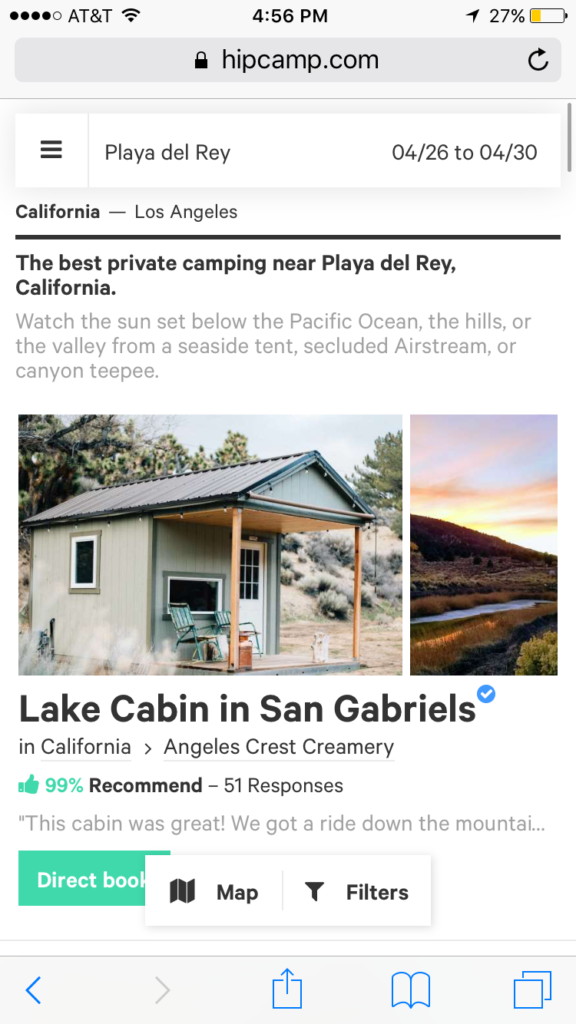
Suggestions:
- The first photo in the listing should take up the entire width of the screen. Currently, the second photo is cut off the screen; the user is unable to scroll through multiple photos in this view (this should be allowed)
- Remove the one-line review excerpt from this view. This will result in a cleaner screen, as most statements are cut off, and do not add value to the customer.
- Allow the user to sort the listings by distance from attraction, rating, and price.
Detailed Campsite Information
The Good:
The detailed campsites each open in a new window. This allows the user to simultaneously view several campsites at one time.
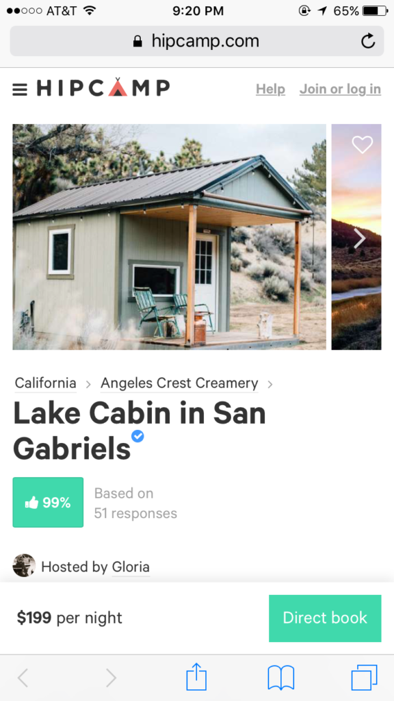
As the user scrolls down the listing, the listing price and call to action booking button persist.
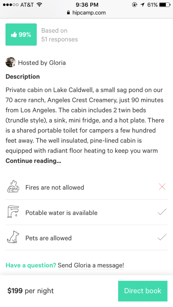
The listing is thorough, with detailed listing information. The link to send a message to the host includes the host’s name, which makes the host seem more personable.
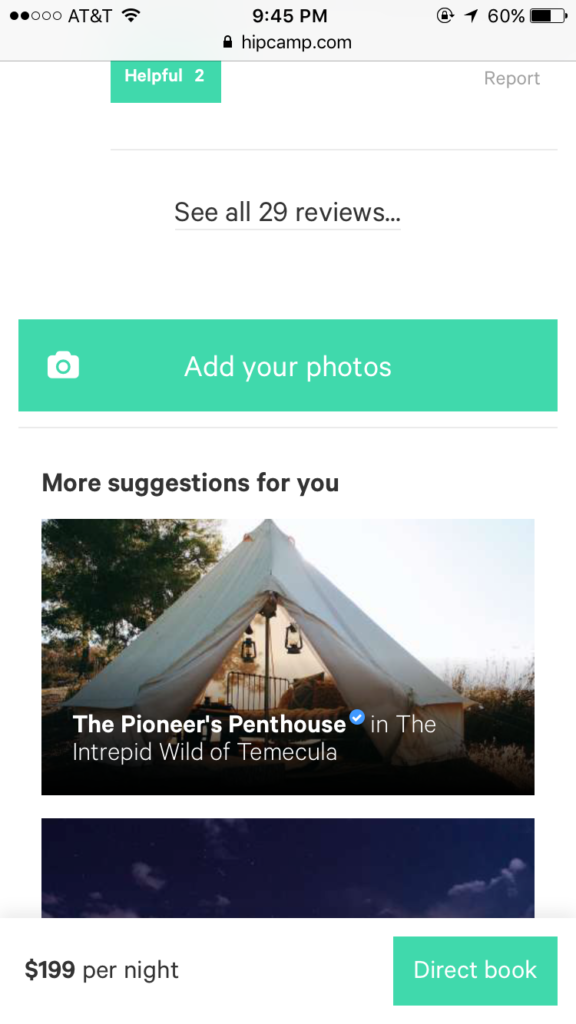
Personalized recommendations for other campsites are listed at the bottom to help users explore additional options.
Suggestions:
- As in the search results list view, the first photo in the listing should take up the entire width of the screen.Currently, the second photo is cut off the screen; the user is unable to scroll through multiple photos in this view (this should be allowed)
- Provide a visual indicator if a review is positive or negative. A thumbs up percentage is presented for the listing, but individual reviews do not have an indication of thumbs up/down. This will help the user go through the reviews quickly, without requiring the user to read each review in detail.

- I would recommend a format change to the thumbs up rating. The color and format of the thumbs up rating looks like a call to action button, yet nothing happens when tapping on the percentage. The user may mistakenly tap on the rating, expecting additional information.
- Show a calendar of dates for which the site is available– desktop website experience currently works as proposed.